
Showing posts with label photoshop. Show all posts
Showing posts with label photoshop. Show all posts
Jan 1, 2010
Nov 14, 2009
A wallpaper made for self
A simple master - piece made with simple steps in a simply awesome software (Photoshop :P).


Sep 29, 2009
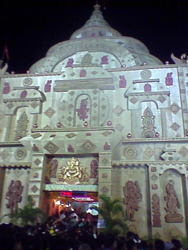
Durga Puja - Bhubaneswar
Well after the sudden orders from the institute to retreat back to our homes, I was given the opportunity to enjoy the puja back at home after 3-4 years.
Well lemme give you a glimpse of the celebration here at Bhubaneswar. [1 thing : the pics were taken by a normal VGA Camera :(]
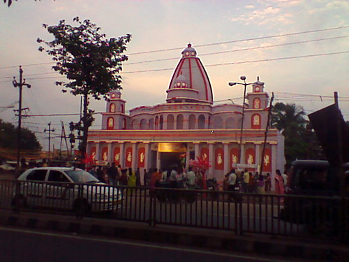
Although simple, this was one of the best works. Odisha is famous for this pandels. No doubt !
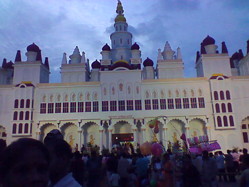
One huge masterpiece. The best part of this pandal is the tribal playing dhols and flutes at the gate.
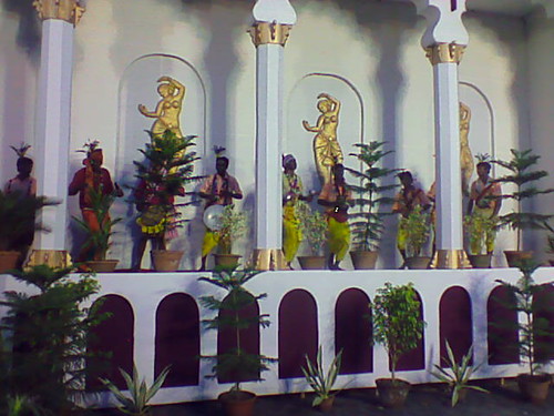
The tribals playing the instruments making the surrounding even more festive.
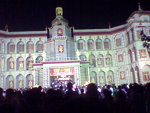
This is another huge one @ Nayapalli. Hats off to the people who dared make it this huge.
This is the best one, entirely made out of floor mats. These people can be real imaginative.
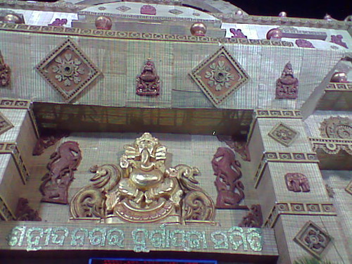
A closeup of the entrance. This is all I could manage in the push and pull of the crowd.
Apart from all these there were a large number of pandals which we couldnt cover due to time constraints. Another thing which I should highlight is the melas rather the village fairs which were adjacent to the pandals. They added to the festive mood. [ I could not take pictures of them due to the VGA Cam :( ]
Neways it was fun out here watching all this. Although, I do miss the celebration back at my college. We had planned a lot for this time puja but the attack of jaundice back in our college forced us all to leave. I miss the joy of organising and being an integral part of the Puja
Well lemme give you a glimpse of the celebration here at Bhubaneswar. [1 thing : the pics were taken by a normal VGA Camera :(]
Although simple, this was one of the best works. Odisha is famous for this pandels. No doubt !
One huge masterpiece. The best part of this pandal is the tribal playing dhols and flutes at the gate.
The tribals playing the instruments making the surrounding even more festive.
This is another huge one @ Nayapalli. Hats off to the people who dared make it this huge.
This is the best one, entirely made out of floor mats. These people can be real imaginative.
A closeup of the entrance. This is all I could manage in the push and pull of the crowd.
Apart from all these there were a large number of pandals which we couldnt cover due to time constraints. Another thing which I should highlight is the melas rather the village fairs which were adjacent to the pandals. They added to the festive mood. [ I could not take pictures of them due to the VGA Cam :( ]
Neways it was fun out here watching all this. Although, I do miss the celebration back at my college. We had planned a lot for this time puja but the attack of jaundice back in our college forced us all to leave. I miss the joy of organising and being an integral part of the Puja
Sep 28, 2009
Durga Puja Notice 2

- BACKGROUND & THEME : At first you should be able to choose a good background and theme. A good background completes half of your task. While choosing or preparing your background make sure you dont have too many colours and designs in it. In that case it becomes difficult to write the text distinctly.Not to mention it should go with your theme.
- FONTS : Next make sure you choose your fonts for a poster. Too many makes it more clumsy and scrappy. On the other hand very less makes it look more official.
- IMAGES : This step is very important. In this step you are supposed to choose icons or some images to put in your poster to make it lively. Make sure you choose the right pictures. I would advice you to go to flickr or photobucket or any image hosting sites which offer good quality images (essentials you have a lot of professional photographers posting their photos there). You should also take care of the border of the photos. They do play an important role in deciding the final look of the poster.
- SELECTION OF COLORS : You should choose yours colors from the images you are using. That brings out a feeling of blending into the theme of your poster
- PLACEMENT : Last but not the least is the proper placement of all the elements that you plan to put on your poster. It should highlight the important things in your poster. Like in my poster i wanted to high light the Specials in my poster not at the cost of Puja timings, so I used icons or pics to highlight the Specials.
It all depends on you , how you place, how you plan and how you execute.
Aug 24, 2009
Durga Puja Notice

This is one of my recent works. For the first time I made use of the pictures which were taken by me. The image down was taken at the time of sandhi puja during Durga Puja 08. Similarly the the image of godesses Durga was taken on vijaya dashami during Durga Puja 08. The only thing i did was apply some filter effects (brush strokes..hmm i dunt remember exactly) to the images and put a nice background which i had. The image came out to be very nice. :)
If you like the work, then do tweet. (added the feature recently :P). Temme how you like it.
May 15, 2009
First Grunge

. Never really tried out such a wallpaper. I really dunno if its good or bad. To give you a brief history (:P) behind this wallpaper, lemme me go back. Well i was on my way back to my home in a train. Thankfully a got a seat where i had a plug point beside my seat (real lucky:) ). So taking the full advantage of situation, i watched a movie (The International - dunt watch it :P) and some videos and yes not to mention i heard some songs which made me feel gud. But then something was wrong, i wasnt really comfortable :(. Ohh yes i found it, i got the upper berth in the train, and sadly i didnt have any space, not even to sit straight. Moreover i could not get a chance to get down to the lower berth and sit due to the family with which i was travelling (they slept throughtout the journey o.0 . So i was sad n happy too for a plug point, so i tried to myself comfortable n tried out on with many brushes. Ending up here wasnt the end of the adventure. After the completion of this i could not save it as a .jpeg file (shame on me :P). After struggling for 15 mins, i found that i had scrolled down in the save options and for that reason i missed out the .jpeg option which was up in the options :P .
Neways do temme how do you find the wallpaper. I ll soon b posting some of my recent works with photos of persons and photoshop. Do check dem out.
.
Apr 5, 2009
Reflection

Isnt dat kool...well lemme present my first tut : reflection effect
We ll b creating a cool wallpaper with ur name written and a reflection below. It indeed brings out a glassy effect n it rocks
Step 1: Open Photoshop and open a new file with d following configuration ( i am making a wallpaper with a size of 1280x800 pixels square :P)

Step 2: Well now get a dark background. I chose a black back ground. And den write your name. Make sure u choose the font correctly. Make sure its bold and do take care about the base of the edges. They (referring to the bases) all should end on a line.

Step 3: This actually is optional at this point but i prefer do now. You can go to your layers panel. If you dunt hav the layer window on your screen, den you can get it by pressing the F7 key. Neways once u get dere, you can manipulate the layer properties. Select the text layer and den double click on the blank area to the right, u can get the sort of window given below. Now you can play with all the parameters and make your name look awsum. Well you can also try out the presets in the styles winidow also.

Step 4: Now rasterize the text layer by right clicking on the text layer in the layer window and den selecting the 'rasterize the layer' option.
Step 5: With th layer selected in the layer window, u can press Ctrl+T, or u can select the area as given in the pic and den click on transform selection
Step 6: Then right click on the selected area and go for prespective option, play around with the end square small boxes and make sure u move dem only in the vertical direction. ( u can play wid it in ne way u want , but for the sake of this wallpaper go according to the specifications)
Step 7: Now hit enter to go for ur transformation.
Step 8: Next create a copy of the layer n using the transformation procedure bring it to the position specified, i.e. invert the image.

Step 9: Now with the newly created, select the shown area and go for 'transform selection' as was mentioned before. Now select the skew option , and in the way first move the corner small squares up and down n bring the image to the shown figure.


Step 10: Next go to the bottom left corner n enable the quick mask by clicking on the icon.

Step 11: Make sure you select the correct parameters as shown in the figures


Step 12: Next apply the gradient, which will look like the figure shown above.
Step 13: Next deselect the mask editing option, and the screen luks sumwht lyk dis except the dotted line covering the upper half. Press Ctrl+Shift+I to inivert the selection and the lower one will get selected.
Step 14: Wid the inverted layer selected,press the delete key n u can see the magic. the shade appears :). You are almost done wid the reflection

Step 15:Now you can for the layer properties of the main layer (text) n change the parameters n hav fun. Make sure you restore the essence of reflection.
Step 16: Well the last step.. Do decrese the opactity of layers which represent the reflection and thus ur work is done

Well how well the relection cumes out, and how all you create your effects all depend on how well you experiment all the tools dat you hav at your disposal. Try out your wacky ideas, create all crap and nonsense and you will end up getting the work up your lifetym.... Well i am still in the process :P
Do temme if u face ne difficulties, i am ready to help you out :). Do post in your ideas about how can u make the work better :)
Subscribe to:
Posts (Atom)


